
Lisboa Seafoods co.
Branding/Package design
_____
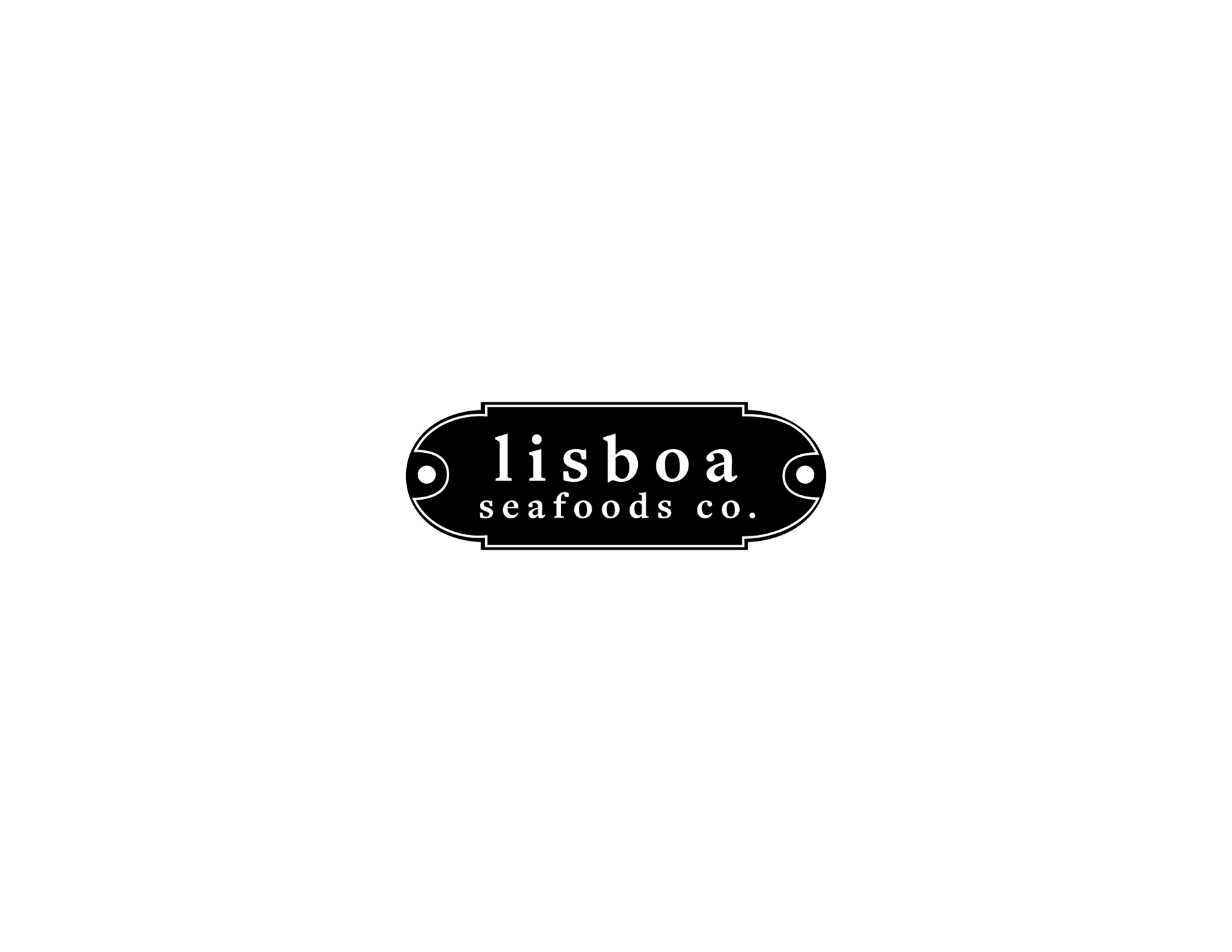
This project was designed for a canned seafood company Lisboa Seafoods Co. based in Lisbon, Portugal. The inspiration for the logo was taken from two elements common at a fishing port; plaques on fishing ships and bright, clear eyes of freshly caught sardines.
This project was designed for a canned seafood company Lisboa Seafoods Co. based in Lisbon, Portugal. The inspiration for the logo was taken from two elements common at a fishing port; plaques on fishing ships and bright, clear eyes of freshly caught sardines.
The logo is meant to communicate the pride of fishermen who go out to the sea to catch the great fish and the quality and freshness that the coastal fish markets offer.
_____
Primary Logo
_____
Alternate Logo

_____
Color + Typography

_____
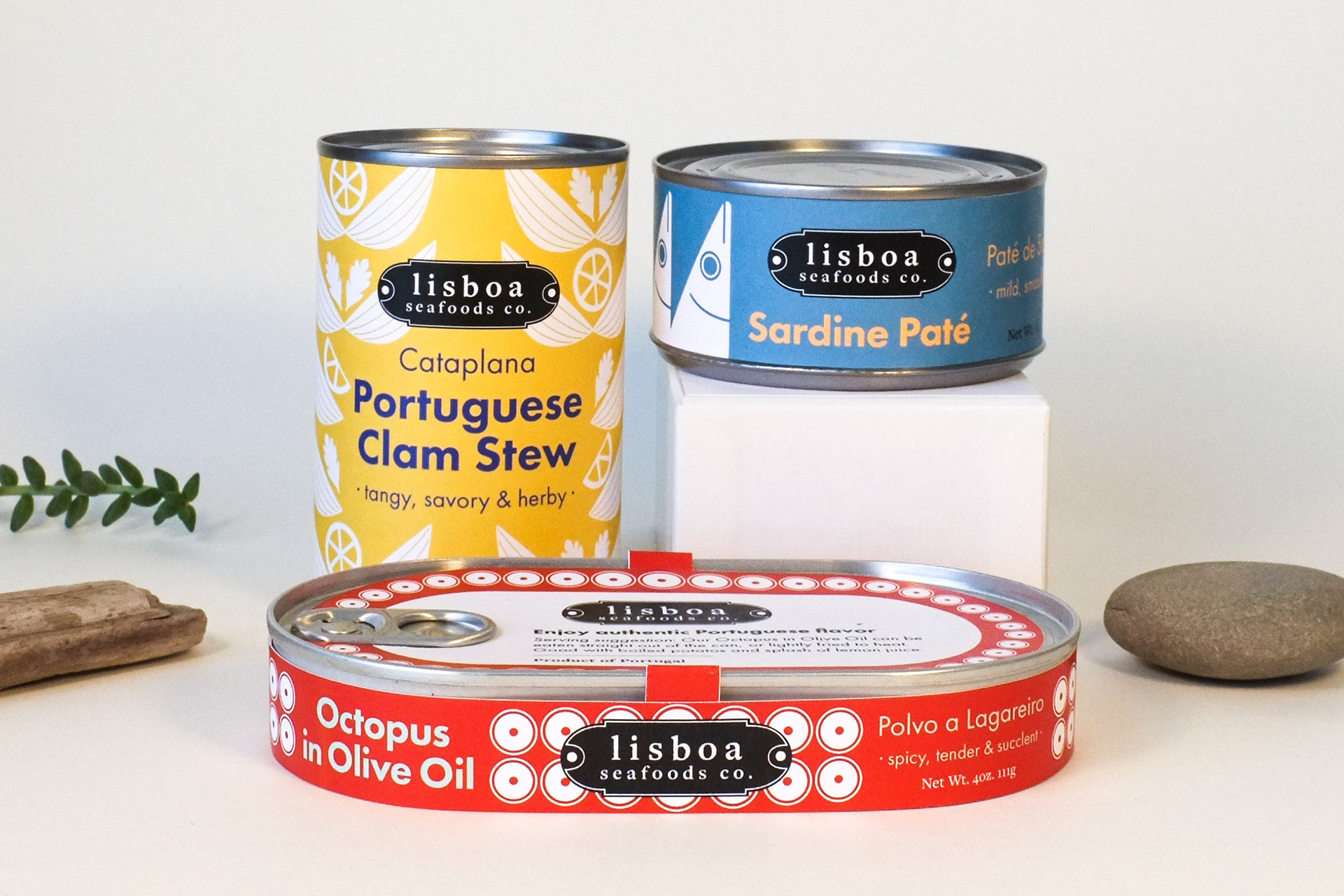
Packaging
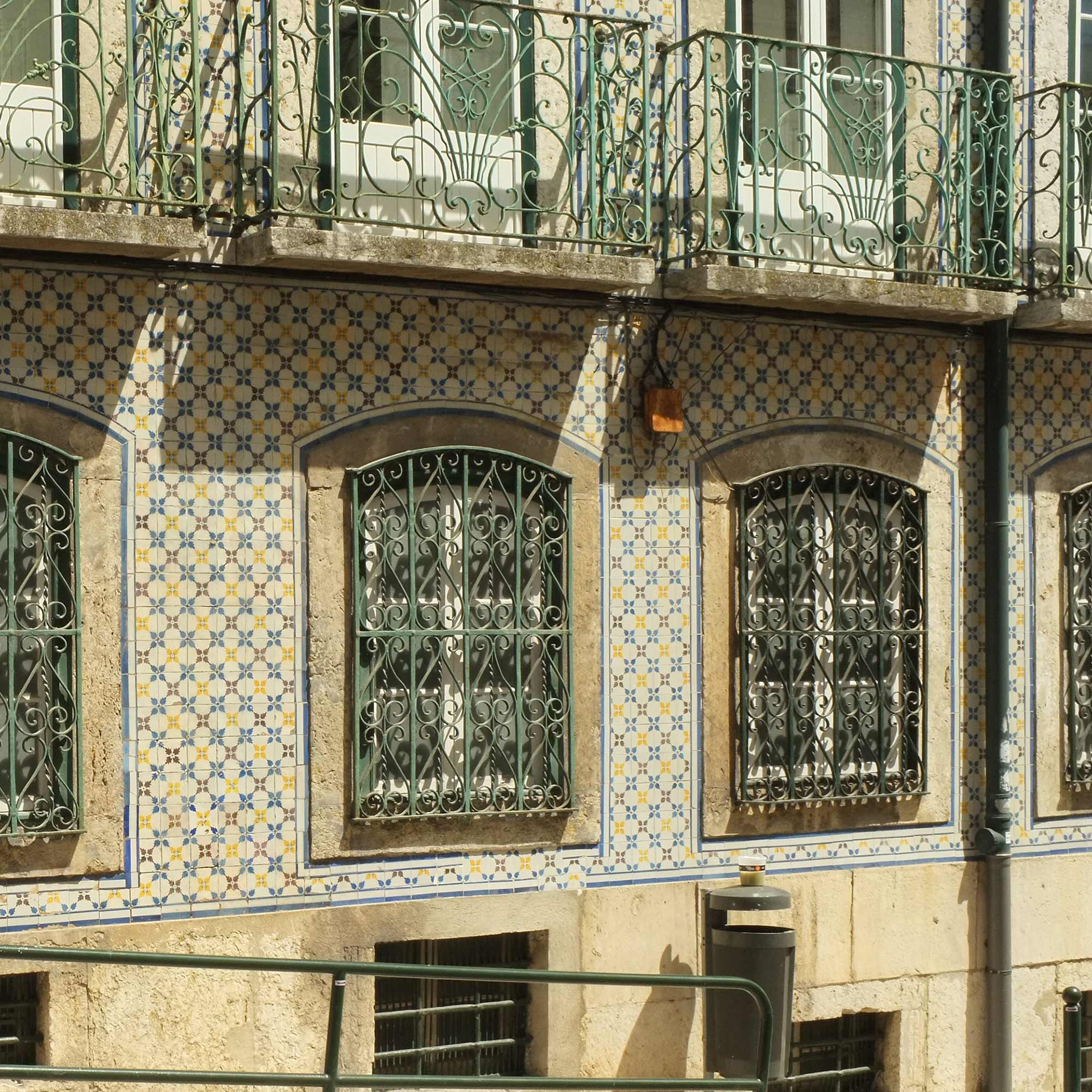
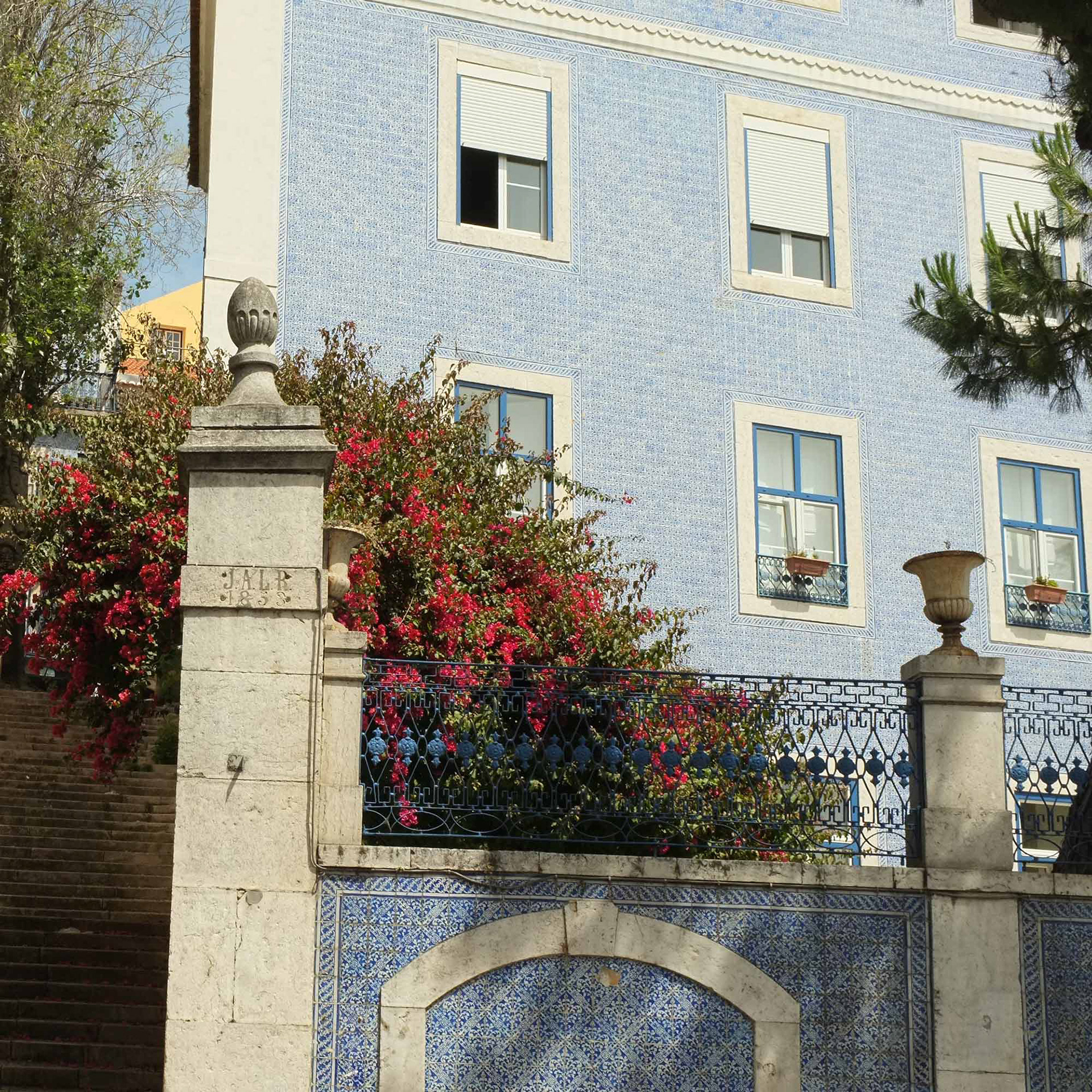
The Package design recalls elements from life in Portugal. Natural hues, Lisbon’s famous ceramic tiles, and of course, the ocean. All adding to the feeling of fresh, locally sourced, quality seafood.
The Package design recalls elements from life in Portugal. Natural hues, Lisbon’s famous ceramic tiles, and of course, the ocean. All adding to the feeling of fresh, locally sourced, quality seafood.
Captivating an audience group who cares deeply about where their food comes from and how it’s produced.
_____
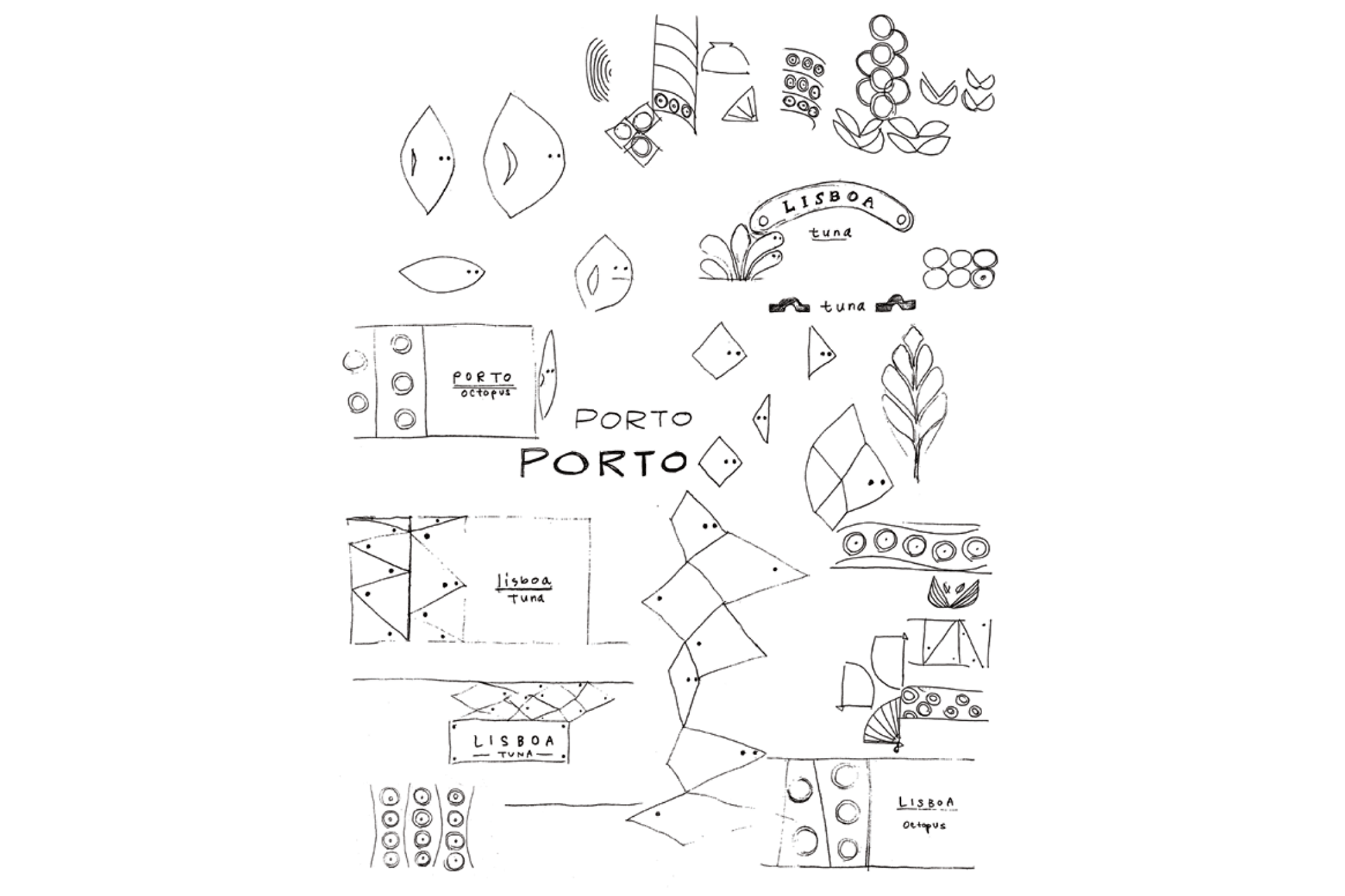
Sketch
_____
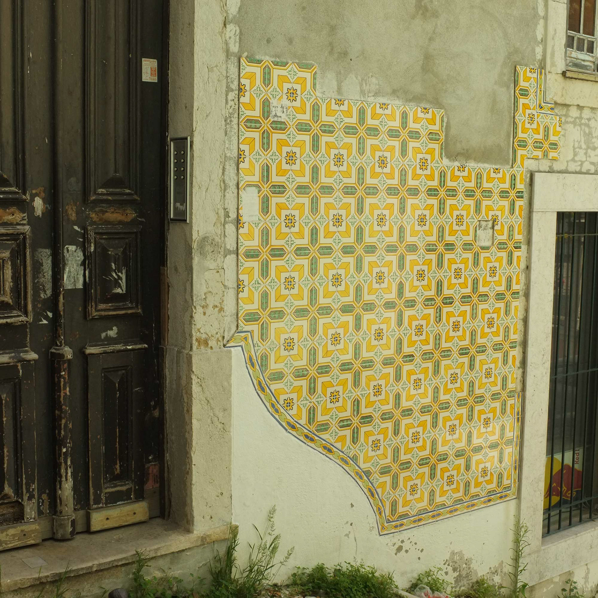
Inspirational photos
Inspirational photos
_____