
Earthquake Safety Card
Illustration / Print Design
_____
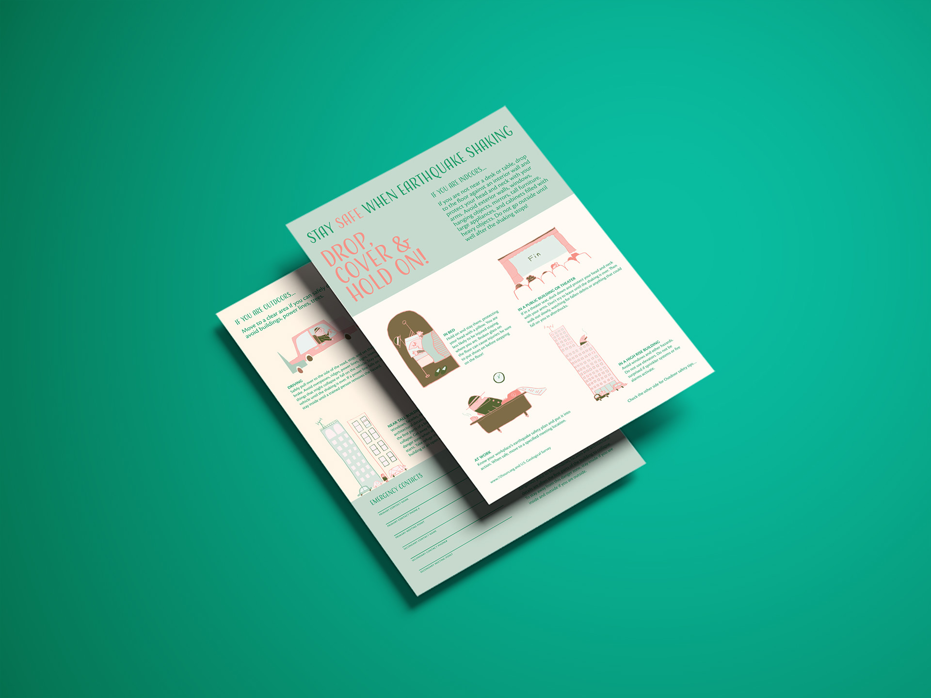
A two-sided, two-color, informational card showing earthquake safety procedures. While providing important safety tips, the card aims to keep the viewer feeling calm and safe with the use of warm color combinations and humanist sans serif. In a style reminiscent of This Is San Francisco, by M. Sasek, this card appeals to SF residents who love Mid Century Modern, vintage posters, and retro advertisements.
A two-sided, two-color, informational card showing earthquake safety procedures. While providing important safety tips, the card aims to keep the viewer feeling calm and safe with the use of warm color combinations and humanist sans serif. In a style reminiscent of This Is San Francisco, by M. Sasek, this card appeals to SF residents who love Mid Century Modern, vintage posters, and retro advertisements.
_____
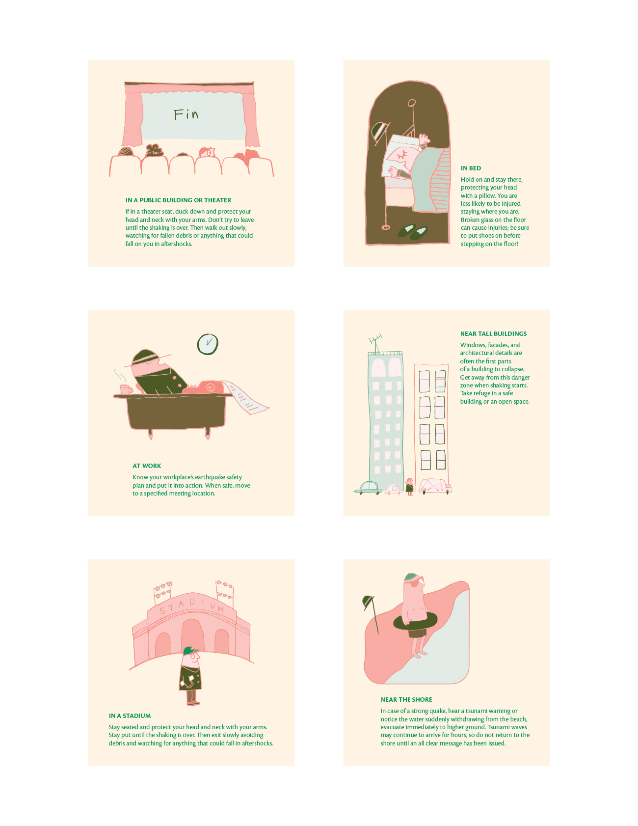
Illustration + Safety Tips
Illustration + Safety Tips
_____
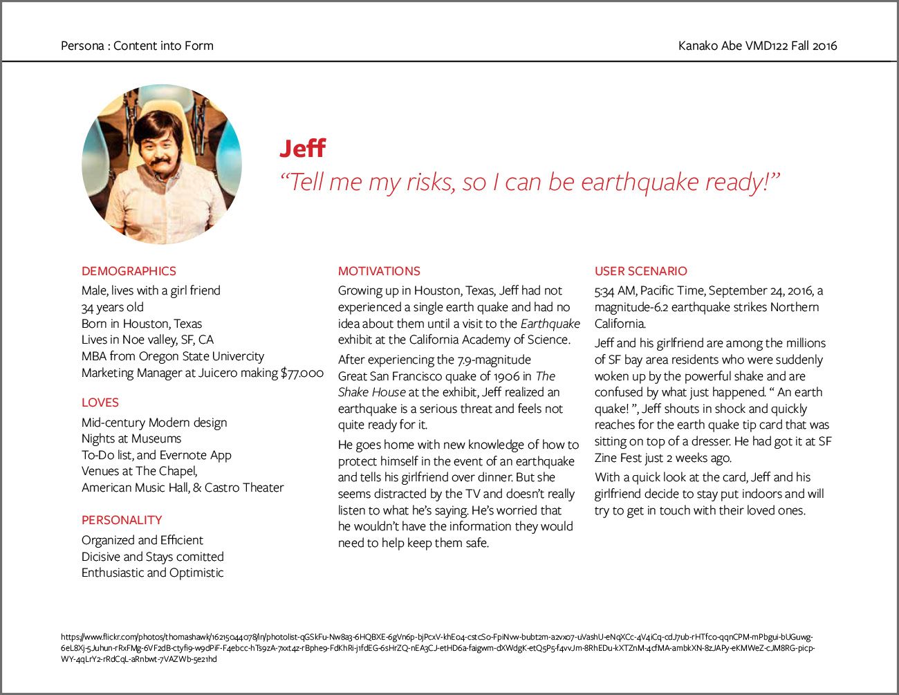
User Persona
In order to better understand the target audiences, I created a persona for this project. The persona helped me to develop focus, measure effectiveness, and design with user-centered approach.
User Persona
In order to better understand the target audiences, I created a persona for this project. The persona helped me to develop focus, measure effectiveness, and design with user-centered approach.
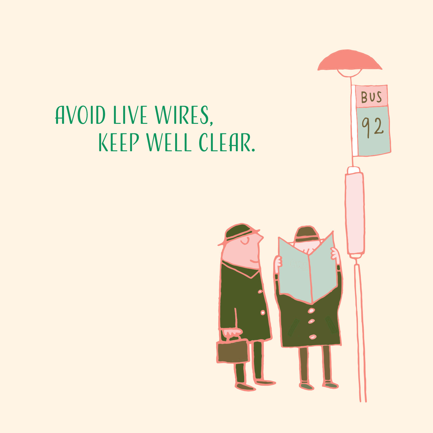
One last safety tip...
_____